Do you have an idea what a pie chart is? Are you taking the IELTS test soon?
If your answer to the first question is ‘No’ and ‘Yes’ to the second question, then it is high time you learn what a pie chart is. It is because chances are, if you are taking the IELTS Academic Test, you will encounter one.
On the other hand, even if you already know what a pie chart is, reviewing its basic features and how it is a significant part of the IELTS Writing Test will aid you achiever your desired band score in the IELTS Writing Task 1.
This article will guide and help you prepare for the IELTS Writing Task 1 if the question is an IELTS pie chart. Please continue reading.
- What is IELTS Writing Task 1?
- What is a Pie Chart?
- What are the Major Features of the Pie Chart?
- How to Analyze the Question?
- How to Structure your Essay for Pie Chart IELTS Question?
- Points to Remember While Writing the Response
- Practice Tips for Evaluating Pie Charts
- Words and Phrases to Use in IELTS Academic Writing Task 1
- Sample Pie Charts Responses with Feedback
- Additional FAQs on IELTS Writing Task 1: Pie Charts Guide
What is IELTS Writing Task 1?
The IELTS Writing Task 1 is the first part of the IELTS Writing Test.
It is different for the IELTS Academic and IELTS General Training modules.
- For the IELTS Academic Writing, you are given either a graph, chart, table, or diagram, and you need to interpret, describe, and explain the information given.
- On the other hand, the IELTS General Writing requires you to compose a letter in response to a given situation.
- Both tasks need you to have at least 150 words.
- You are advised to spend 20 minutes at most finishing this task because the IELTS Writing Task 2 has more weight.
What is a Pie Chart?
An IELTS pie chart task is one of the tasks you might be given in the IELTS Academic Writing Task 1.
It is a form of a graph that uses a circular representation to display data. The graph’s parts are proportional to the percentage of the full number in each group. To put it simply, the size of a slice of the pie is proportional to the size of the group as a whole.
The full ‘pie’ represents 100% of the total pie, whereas the pie ‘slices’ represent parts of the whole.
What are the Major Features of the Pie Chart?
Pie charts have unique characteristics that make them different from the other tasks in the IELTS Writing Academic Task 1. Before taking the test, make it a point that you familiarize yourself with these features to avoid confusion.
- Title: The title gives a quick summary of what is in your pie chart. This makes it easier for the readers to figure out what they are about to look at. It is not an issue if it is creative or simple as long as it explains the chart.
- Legend: The legend explains what each slice stands for. It aids the reader in understanding what they are looking at.
- Source: The source specifies where you obtained the data in your graph. It is critical to acknowledge those who gathered your data.
- Data: The information, or data, that your chart contains is the most significant component of it. Data is shown in pie charts as part of a 100-point scale (a percentage). Each slice represents a unique piece of information.
How to Analyze the Question?
Part of the criteria for your writing in the IELTS Academic Writing Task 1 is Task Achievement. Were you able to accomplish what is asked of you? That is why to get your desired band score. It is a must that you analyze the question carefully.
- Examine the pie charts and make a plan of what you will write: This is probably the most important stage in the IELTS Writing Test because what you plan will dictate the flow of your writing. Keep in mind that you need to analyze the IELTS pie charts carefully. Study the given details before planning on what to write.
- Compare the main features to each other: The IELTS pie chart is meant to compare and contrast the given information. These comparisons will aid you in developing a strategy for the body of your IELTS Writing Task 1. Remember that you should not state your opinions and that you are only asked to examine, describe and explain the data given.
- Select the data for the overview statement: The next step is to consider what information should be included in the Overview statement. Remember that an ‘Overview Statement’ summarizes what you believe is the most important information to know about the pie chart.
- Write the overview paragraph: The last step is to write your response in the IELTS Academic Writing pie chart task. The first paragraph, the ‘overview paragraph,’ must be written first. Remember two tips when writing your response. First, you need to paraphrase the task, and second, have your overview statement followed by supporting and relevant details.
Paraphrasing the Question
Paraphrasing the question is essential in the IELTS Academic Writing pie chart task. It increases your chances of getting a high mark from the examiner as it demonstrates that you have a wide range of vocabulary.
For example, the given description is “The pie charts compare various means of purchasing beauty products from 2005 to 2015”.
You should rephrase this by utilizing your own grammar and vocabulary as possible. You also need to get a little more specific about the kind of information in the pie chart.
The sentence below might be one way to paraphrase the description sentence:

“Over a ten-year span, the pie charts compare six different methods of purchasing beauty items.”
How to Structure your Essay for Pie Chart IELTS Question?
The way you structure your writing in the IELTS Academic Writing pie chart task will dictate your fate in this part of the test. That is why, in the next section of this article, we have listed the steps that you should follow when writing your 150-word (or more) output.
Example:
Step 1 — Analyze the question
Every IELTS Academic Writing Task 1 question has the same format. Here’s another version of our practice question, this time with the words that will appear in all of the questions highlighted.
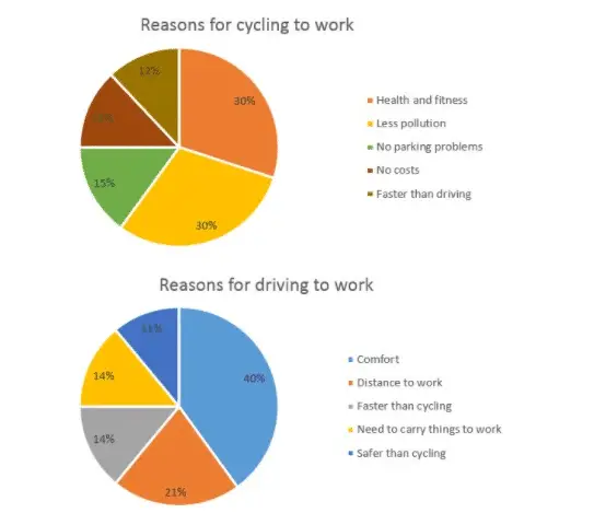
The graph below depicts the reasons why people choose to commute to work by bicycle or car.
Select and summarize the most important data elements and draw comparisons where appropriate.
All questions in the IELTS Academic Writing pie chart task consist of:
- 1st sentence – A brief description of the task
- 2nd sentence – The instructions
- 3rd sentence – The graphic (graph, chart, table, diagram)
The second sentence of the IELTS Academic Writing pie chart task instructs you what to do. You should do the following:
- Choose the main features.
- Write about the main features.
- Compare and contrast the main features.
Step 2 — Identify the Main Features
In the IELTS Academic Writing pie chart tasks, the graphic should be simple to understand. Each question is designed to assess your language skills rather than your numerical skills.
Percentages or proportions are always shown in pie charts. Apart from that, they are similar to bar charts and line graphs in that they’re a visual representation of data.
Here are some good questions to ponder.
- What unit of measurements are used?
- What does the title and label say?
- What is the most notable trend of the graphic?
- What are the similarities and differences?
Example:
The pie chart demonstrates two distinct ways of getting to work and the reasons why people pick these modes of transportation.

These IELTS pie charts have two essential features:

1st main feature: "The majority of cyclists do it for the sake of their health and the environment."

2nd main feature: "Most people who drive do so because it is convenient."
Step 3 — Write the Introduction
Simply paraphrase the question in the introduction. Express similar sentences differently. This can be accomplished by employing synonyms and altering the phrase structure.
Example
Question:
The graph below depicts the reasons why people choose to commute to work by bicycle or car.
Introduction (1st Paragraph):

By proportion, the two pie charts show the main reasons why people prefer to cycle or drive to work.

For the introduction, this is all you need to write.
Step 4 — Write an Overview
The primary elements shown in the pie charts should be reported in the second paragraph, with just broad information provided. The essay’s detail comes later. You should also make any obvious comparisons you notice.
Example:

1st Main Feature:

 "The majority of cyclists do it for the sake of their health and the environment."

2nd Main Feature:

"The majority of people who drive do so because it is convenient."

3rd Main Feature:

"A nearly equal proportion of respondents believe that their preferred approach is the fastest."
Overview (2nd Paragraph):

"Most people who prefer to cycle to work do so for health and environmental reasons. In contrast, the primary benefit of driving to work is perceived to be the convenience of traveling by car. Notably, the fastest approach is chosen by about an equal number of persons."
Step 5 — Write the First-detail Paragraph
More specific information regarding the data in the image should be included in paragraphs 3 and 4 of your IELTS Academic Writing pie chart essay.
In paragraph 3, you should support your first essential characteristic with proof. Remember to make comparisons when appropriate.
Example:

1st Main Feature:

"Cycling is done by most people for health and environmental reasons."

3rd Paragraph:

"Over half of all persons who choose to travel by bike cite health and fitness and fewer pollution as reasons. Each account for 30% of the total, which is more than double the next most prevalent reason, a lack of parking, at 15%."
Step 6 — Write the Second-detail Paragraph
You repeat the process for your second significant characteristic in the fourth and final paragraph. If you need to add a third primary feature to complete the essay nicely, do so.
Example:

2nd Main Feature:

"The majority of people who drive do so because it is convenient."

3rd Main Feature:

"A nearly equal proportion of respondents believe that their preferred approach is the fastest."

4th Paragraph:

"Those who opt to commute by automobile deal with a distinct set of issues. By far, the most important feature, comfort, is cited by 40% of respondents, yet the distance to work is cited by slightly over a fifth of drivers. A shorter journey time is important to 14 percent of people, compared to 12 percent of bikers who believe their mode of transportation to be speedier."
Because the question does not specify a time range, you can use either the present simple tense or the past simple tense. The present simple tense was used. Remember to be consistent with your tenses throughout your essay, regardless of which one you chose.
Sample — Complete IELTS Academic Writing Pie Chart Essay:
"By proportion, the two pie charts show the main reasons why people prefer to cycle or drive to work.

Most people who cycle to work do so for health and environmental reasons. In contrast, the primary benefit of driving to work is perceived to be the convenience of traveling by car. Notably, the fastest approach is chosen by about an equal number of persons.

Over half of all persons who choose to travel by bike cite health and fitness and fewer pollution as reasons. Each account for 30% of the total, which is more than double the next most prevalent reason, a lack of parking, at 15%.

Those who opt to commute by automobile have to deal with a distinct set of issues. By far, the most important feature, comfort, is cited by 40% of respondents, yet the distance to work is cited by slightly over a fifth of drivers. A shorter journey time is important to 14 percent of people, compared to 12 percent of bikers who believe their mode of transportation to be speedier."
180 Words
Points to Remember While Writing the Response
To obtain a high mark in the IELTS Academic Writing pie chart task, you should bear in mind the following:
- Be consistent with the verb tenses: This means that if the pie chart image is in the present, your explanation should also be in the present tense. If your chart reflects the past, the explanation must be in the past tense.
- Meet the minimum number of words required: Write at least 150 words. Otherwise, it can be rejected. To avoid being rejected, make sure your answer is at least 155-190 words long while writing the explanation.
- Have a clear comparison of the data: Comparing two graphs is frequently easier than creating an explanation for a single graph. Because of this, you need to pay close attention to every aspect to develop excellent ideas to write about the chart.
- Do not deviate from the given topic: The answer you write must correspond to the chart exactly. When composing the explanation, you must exercise considerable caution. So, before you start writing on the chart, have a good look at it.
- Make it easier to read: When writing an IELTS Academic Writing pie chart task, organize material logically to make it easier to follow and read. Rather than writing about each chart independently, the most natural thing to do with an IELTS pie chart is to compare categories across charts, concentrating on similarities and contrasts.
Practice Tips for Evaluating Pie Charts
Accomplishing an IELTS Academic Writing pie chart task is not as easy as it seems.
It entails a lot of preparation, and that is why you are advised to consider the following when you practice for the IELTS Academic Writing pie chart task.
- Know what a pie chart is:
Pie charts are extremely useful when comparing a specified category (a slice of the pie) to the whole (the entire pie). The area of pie chart slices is a better representation of the relative size. Inflations and deflations, numbers per category, or direct correlations between categories in which one set of statistics depends on another should not be shown using pie charts. Using a line graph is a better format to utilize in this scenario.
- Have annotations:
Outside of minor fractions like 1/2 (50 percent), 1/3 (33 percent), and 1/4 (25 percent), it is actually quite difficult to deduce exact proportions from pie charts (25 percent). Furthermore, if the slice values are designed to represent amounts rather than proportions, pie charts usually lack the tick markings that allow direct value calculation based on slice sizes. Annotations are a regular feature of pie charts because of these reasons.
- Think about the order of the slices:
A solid slice order can make it easier for a reader to understand what is being said in the pie chart. When there are categories with relatively comparable values, a usual ordering goes from the largest slice to the smallest slice, which is highly useful. If the category levels have a natural ordering, plotting slices is usually preferable.
- Keep the amount of pie pieces to a minimum:
It can be tough to understand pie charts with many slices. It is difficult to identify the smallest slices, and it can also be difficult to select enough colors to distinguish all of the slices. Recommendations vary, but you should consider utilizing a different chart type if you have more than five categories. Another possibility is to combine little pieces into a single ‘others’ slice, which would be colored in a neutral gray.
- Do not use distorting effects:
To read a pie chart correctly, slices of the areas, arc lengths, and angles must all relate to an appropriate depiction of the data. While it is good to prevent 3-d effects in any plot, it is especially critical with pie charts. Squeezing or expanding the circle, or adding too much depth, can easily alter the size of each slice in relation to the total.
Words and Phrases to Use in IELTS Academic Writing Task 1
Vocabulary accounts for 25% of your marks in the IELTS Writing Test.
To earn a good score, you must produce accurate and strong descriptions and analyses for the provided graph(s) or diagram. It is simple to keep repeating phrases and numbers in this minimum 150-word essay.
However, this is not an excellent way to get a decent grade. You must utilize a variety of terminology that describes and emphasizes the changes, similarities, and contrasts in the data.
Here are some of the words and phrases that will help you accomplish the IELTS Academic Writing pie chart task.
Adjectives:
- slight
- steep
- sharp
- rapid
- steady
- gradual
- modest
- dramatic
- moderate
- significant
- considerable
Nouns:
- dip
- fall
- rise
- drop
- slump
- peak
- growth
- decline
- increase
- variation
- decrease
- fluctuation
Verbs:
- fall
- drop
- rise
- jump
- grow
- climb
- rocket
- plunge
- decline
- increase
- decrease
- go down
- plummet
Adverbs:
- rapidly
- slowly
- slightly
- steeply
- sharply
- steadily
- gradually
- moderately
- modestly
- dramatically
- significantly
- considerably
General Trend:
- Overall…
- It is clear…
- In general…
- In common…
- It is obvious…
- At the onset…
- It is clear that…
- As can be seen…
- As it is observed…
- As a general trend…
- As it is presented…
- At first glance…
- Generally speaking…
- It can be clearly seen that…
- As an overall trend/ As overall trend…
- A glance at the graph(s) reveals that…
Body:
- According to…
- It is clear that…
- According to the…
- It is possible that…
- It is worth noting…
- It is obvious that…
- It is stated directly that…
- Categorically speaking…
- As shown in the image…
- Returning to the specifics…
- As can be observed in the…
- It is without a doubt/clear that…
- It can plainly be seen that…
- It can plainly be seen that…
- Returning to the specifics…
- Now, returning to the details…
- It is worth mentioning that…
- It appears to be the case that…
- It is evident from the statistics…
- As you can see from the diagram…
- Based on the facts, it appears that…
- The figure is depicted in the graph…
Summarizing:
- Overall, the picture is clear…
- The majority/minority, in general…
- To summarize, the most significant difference is…
- To summarize, the most notable tendency is…
Predictions:
- is shown to…
- is expected to…
- is forecast to…
- is predicted to…
- is projected to…
Approximations:
- Nearly
- Roughly
- Almost
- About
- Around
- Just over
- Just under
- Just around
- Just about
- Just below
- Approximately
- More or less
- A little more than
- A little less than
Fractions:
- 33% – nearly a third
- 4% – a tiny fraction
- 50% – exactly a half
- 48% – around a half
- 52% – just over a half
- 48% – just under a half
- 23% – almost a quarter
- 27% – roughly one quarter
- 75% – nearly three quarters
- 78% – approximately three quarters
Proportions:
- 12% – a small minority
- 80% – a large proportion
- 68% – a significant majority
- 4% – an insignificant minority
Sample Pie Charts Responses with Feedback
To get an idea of how the questions in the IELTS Academic Writing pie chart task are posed, you are advised to study some sample responses. It will also help you structure your essay. Here are some of them:
Band 7
Sample Response:

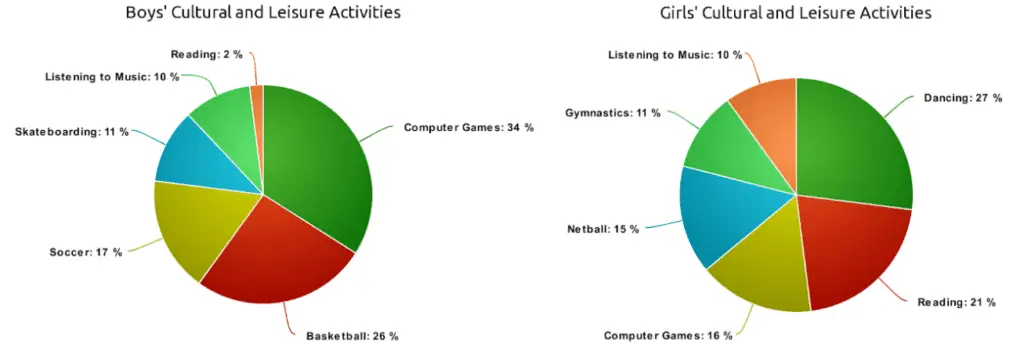
"The two pie charts represent the findings of a survey of boys' and girls' cultural and recreational activities.

Overall, both sexes enjoyed listening to music equally, while girls enjoyed reading significantly more than boys. There were also a lot of variances in the kids' favorite sports.

When we look at the first graph, we can see that guys prefer to play computer games (34 percent) above other activities. Basketball is the second most popular pastime, with over a third of male children participating. Basketball is followed by soccer, which is played by 17% of the population. Skateboarding and listening to music are the least popular pastimes among guys, with 11 percent and 10% choosing them, respectively. Only 2% of males participate in reading, the least popular cultural activity.

If you take a closer look at graph number 2, dancing is the most popular pastime among girls, accounting for 27% of the total. Reading is preferred by more than a fifth of all girls, in contrast to the boys' preferences. Despite the fact that the number of female youngsters who play computer games is nearly half that of males (16%), it is the third most popular activity among girls. The only difference between computer games and netball is that the latter is played at a 15% rate. Gymnastics is popular among girls in the same way that skateboarding is popular among boys. Listening to music is the least popular pastime, with a percentage of 10%, which is the same as those on the first chart. "
254 Words
Our Feedback on the Above Essay:

The essay was able to cover the task’s requirements. The major features/bullet points are clearly presented and highlighted, although there is room for improvement.

The facts and ideas are rationally organized, and there is a clear trend throughout. It makes adequate use of various cohesive devices, while there may be some under-/over-use. It employs a wide range of complicated structures.

There were some occasional grammatical, spelling, and word-formation mistakes.
Band 8
Sample Response:

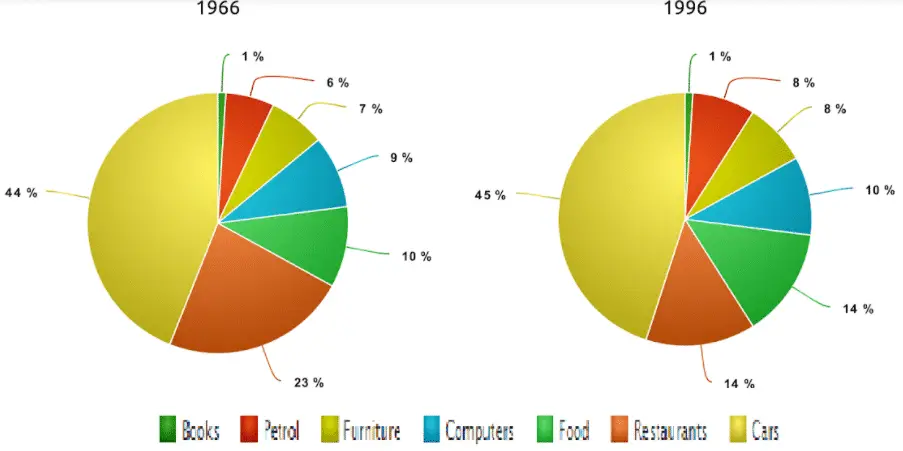
"From 1966 to 1996, the pie charts given compare the expenses of US citizens in seven groups in two different years. The percentages are used to calibrate the data.

Overall, expenditures on vehicles, restaurants, and computers showed an upward trend, but expenditures on the remaining categories decreased.

Food and automobiles accounted for the majority of American residents' spending. On the other hand, Computers and books had the lowest percentages in the chart in 1966 and 1996, respectively. In 1996, however, the percentage of people who drive a car nearly doubled to 45 percent. On the other hand, food spending plummeted from 44 percent in 1966 to only 14 percent in 1996.

The most dramatic change was witnessed in the computer industry, which went from 1% in 1966 to 10% in 1996. The percentage of Americans who spend money in restaurants has doubled since 1966, from 7% to 14% in 1996. The purchase of books, on the other hand, has decreased significantly. Surprisingly, the ratio of petrol to furniture did not alter significantly over time"
178 Words
Our Feedback on the Above Essay:

It sufficiently meets all of the task's requirements. It effectively and appropriately presents, accentuates, and demonstrates major features/ bullet points.

Furthermore, it logically sequences information and ideas, and effectively manages all elements of cohesion. It also utilizes paragraphing adequately and acceptably.

Diverse vocabulary is used to convey exact concepts fluently and flexibly. There were only very few errors in spelling and word formation.
Band 9
Sample Response:

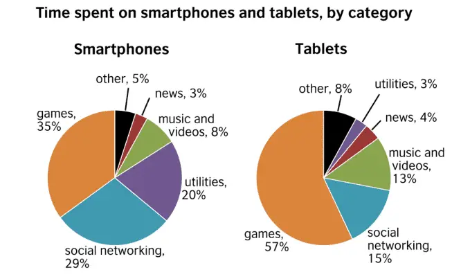
"In general, the two pie charts illustrate that smartphones and tablets are used for similar purposes, but to varying degrees.

The first pie chart depicts how people spend their time on smartphones, while the second chart depicts how people spend their time on tablets. Games are the most popular usage for both sorts of devices, but the numbers vary significantly. Playing games takes up 57 percent of time spent on a tablet, but just 35 percent of time spent on a smartphone. On the other hand, smartphone users spend 29 percent of their time on their devices accessing social networking sites, compared to only 15 percent of tablet users.

Users spend 13 percent of their tablet time watching videos and listening to music. It is the third most prevalent use of the table. On the other hand, smartphone users spend only 8% of their time on their phones on entertainment, preferring to spend 20% of their time on their phones on utilities. Maps, weather information, and calculators are examples of these.

There is a distinct distinction in how individuals use their cellphones and tablets. While tablets are more commonly used for gaming and other forms of enjoyment, smartphones appear to be the preferred device for tasks and communication with the outside world."
212 Words
Our Feedback on the Above Essay:

It fully meets all of the task's requirements. The structure of the responses is clearly well thought of.

Paragraphing was skillfully managed.

A large vocabulary was employed with natural and sophisticated lexical control. Minor errors only arise as 'slips.’

Also, an extensive range of structures with complete flexibility and accuracy was employed.
Additional FAQs on IELTS Writing Task 1: Pie Charts Guide
How Do You Write an Answer IELTS Pie Chart Question?
To write an IELTS Academic Writing pie chart task, you need to analyze the question first. Then, identify its main features.
Next, you have to write the introduction, overview, and summary. Please review our suggestions discussed above to ace this question type.
How Do You Write a Summary for the IELTS Academic Writing Pie Chart Task?
The summary is the last part of the IELTS Academic Writing pie chart task.
Therefore, before you can write one, you should first analyze the data and identify its main features. From there, you can write your summary.
Do not make it too long. It should be a short and brief conclusion on what you have written.
How Long Should I Spend in the IELTS Academic Writing Pie Chart Task?
You are strongly advised to spend no more than 20 minutes on the IELTS Academic Writing pie chart task because the second task carries more weight.
However, that is not to say that you should neglect this part of the test. The first task also accounts for your overall marks in the IELTS Writing Test, so you should give your best performance in both tasks.
